
![]()
Want a kitchen that feels brighter, more organized, and less visually busy? This Richmond Hill, Ontario remodel by interior designer Ana Micieli, founder of Micieli Design, transformed a dark cherry kitchen into a bright transitional space built around white cabinetry, marble-look surfaces, a walnut island, and strong architectural details.

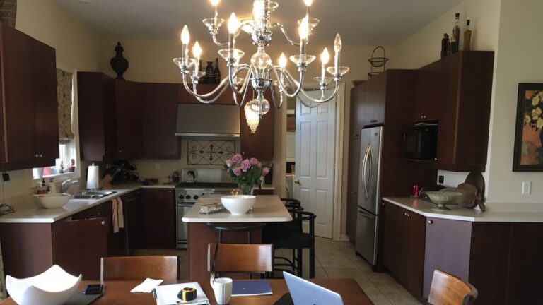
The original kitchen already offered generous storage, ample counter space, a central island, and a functional layout. Dark cherry cabinetry covered nearly every wall, while crystal lighting, heavy furniture, and decorative accessories created a dense appearance that reduced the impact of the room’s natural light.
Rather than expanding the footprint, the renovation focused on contrast, proportion, and material selection. White cabinetry brightened the room, a naturally stained walnut island introduced texture, and a simplified palette allowed each design element to stand on its own.
To better understand the design decisions behind the transformation, we had the opportunity to speak with Ana Micieli about the challenges, priorities, and key choices that shaped the finished kitchen.
Dark Cherry Cabinetry Surrounded the Entire Room

The original kitchen already offered a strong foundation. Cabinetry wrapped nearly every wall, the island provided additional workspace and seating, and the layout supported cooking, dining, and entertaining within one open space.
What dominated the room was the dark cherry finish. Upper and lower cabinets extended across almost every visible surface, creating a continuous band of dark wood. Combined with the matching dining table and chairs, the kitchen appeared heavier than its footprint suggested.
Storage Filled Every Corner

This angle reveals the full extent of the cabinetry.
Tall pantry cabinets, upper cabinets, lower cabinets, and corner storage delivered substantial functionality, but the uninterrupted cherry finish reduced contrast throughout the room. Even the stainless appliances became secondary to the cabinetry surrounding them.
The kitchen offered extensive storage, yet the concentration of dark finishes created a crowded appearance.
Crystal Fixtures Added More Visual Competition
The island already served as the center of the kitchen.

Crystal pendants introduced another decorative element into a room filled with dark cabinetry, patterned window treatments, countertop accessories, wall décor, and display pieces above the cabinets.
Many elements competed for attention, leaving little separation between focal points.
Natural Light Struggled Against the Dark Palette

Large patio doors and a generous window brought significant daylight into the space.
Despite those advantages, much of the available light disappeared into the cabinetry, furniture, and darker decorative accents. The chandelier became the dominant focal point while the architecture faded into the background.
The kitchen did not need a larger footprint. It needed a lighter palette and a clearer design direction.
The Designer’s Biggest Challenge
Designer Insight
Question from Homedit.com
What was the biggest design challenge in transforming this kitchen, and how did you solve it?
Ana Micieli
Founder, Micieli Design
The biggest challenge was incorporating more appliances and larger ones without creating a heavy wall of equipment that killed the light and airy feel we were going for. The original kitchen had fewer and smaller appliances, so scaling up was a real design problem. The client had her heart set on her new appliances and needed them to work both aesthetically and functionally. We went with a concealed fridge and freezer, added open display above them to break up the mass, and concealed the hood fan inside a custom bell-curved surround that became a visual anchor for the whole room rather than an eyesore.
White Cabinetry Changed the Entire Kitchen

The transformation starts with the cabinetry.
White and soft grey cabinets replaced the dark cherry finish that once defined the room. The lighter palette reflects natural light across the kitchen and creates stronger contrast against surrounding surfaces.
What once felt dominated by wood now feels open, bright, and balanced.
Floor-to-Ceiling Millwork Added a Custom-Built Look

The new design extends upward with stacked upper cabinets, crown molding, and integrated millwork.
Instead of stopping below the ceiling, the cabinetry now feels connected to the architecture of the room. The added height draws attention upward and strengthens the presence of the kitchen.
The result resembles custom millwork rather than standard cabinetry.
The Walnut Island Anchors the Space
Rather than carrying white cabinetry across every surface, Ana Micieli introduced contrast through the island.

The naturally stained walnut finish separates the island from the perimeter cabinetry and introduces texture through visible grain patterns. The island now commands attention from every angle and establishes a clear center point within the room.
What Existing Feature Was Worth Preserving?
Designer Insight
Question from Homedit.com
The original kitchen already had a functional layout and plenty of storage. What existing feature was worth preserving, and why?
Ana Micieli
Founder, Micieli Design
We kept the transition area into the dining room, which was functioning as a butler’s pantry. The bones were good, so rather than rip it out, we elevated it. We added a wine fridge and created decorative open storage above for china and collectibles the clients wanted to display. It went from a pass-through to a genuine feature moment.
The Cooking Wall Became an Architectural Feature

One of the strongest changes appears above the cooking area.
A custom hood surround framed by marble-look wall panels transformed the range wall into a focal point. Curved detailing near the ceiling introduces craftsmanship and connects the feature to the surrounding millwork.
Instead of functioning as separate elements, the wall now reads as one composition.
Marble-Look Surfaces Reduced Visual Noise

Many kitchens become busy because every surface introduces a different material, pattern, or color.
Here, marble-look surfaces continue across the countertops and backsplash with minimal interruption. Subtle veining introduces texture while maintaining a calm backdrop for the cabinetry and island.
The simplified palette allows major design elements to stand out without competing against one another.
Simpler Lighting Opened the Room

The original crystal fixtures gave way to globe pendants with clean lines and transparent glass.

The new fixtures provide presence above the island without overwhelming the room. Their lighter profile allows views to move across the kitchen while drawing attention to the island below.

The extended countertop creates a floating appearance above the walnut base, while the upholstered counter stools introduce soft curves and subtle gold accents that connect with details found throughout the kitchen.
Advice for Homeowners With Dark Cherry Kitchens
Designer Insight
Question from Homedit.com
Many homeowners have similar dark cherry kitchens but aren’t ready for a full renovation. If you had to prioritize one or two upgrades for the biggest impact, where would you invest first and why?
Ana Micieli
Founder, Micieli Design
Have your cabinetry professionally painted and swap out the countertops and backsplash. Those two moves will completely transform the feel of the space without gutting everything. The bones of most kitchens are perfectly fine, it’s the finishes that date them.
A Bright Kitchen With Strong Architectural Presence


Ana Micieli approached the renovation with a clear objective: create a kitchen that feels inviting without appearing busy. White cabinetry brightened the room, floor-to-ceiling millwork added architectural character, marble-look surfaces simplified the material palette, and the walnut island introduced contrast against the lighter finishes.
The transformation exceeded the homeowners’ expectations.
“Thank you again for your invaluable expertise, attention to detail and professionalism. Our kitchen looks amazing. We were so excited to show it off to family and friends. Your patience was greatly appreciated as many changes came into play from our end. As a renovation is a little overwhelming, you kept us calm and on course. Your passion and commitment to your craft was certainly evident. Most importantly we trusted you to ensure our vision came to life and it did. You are a pleasure to work with and I look forward to our next renovation.”
— Lanea
What Do You Think?
Would you choose the walnut island as a contrast to the white cabinetry, or would you have carried the white finish across the entire kitchen? Share your thoughts in the comments.
All image credits go to Ana Micieli, founder of Micieli Design
Follow Ana on instagram @micielidesign