
Want a kitchen that doesn’t disappear into neutral walls? Most backsplashes stay safe. Flat color, simple layout, no real impact. They protect the wall, but they don’t shape the space.

In 2026, that changes. Tile is no longer a background layer. It becomes the element that defines where the kitchen starts and how it feels. Pattern replaces blank space, and even small sections of tile start to control the entire room.
These ideas show different ways backsplashes shift from filler to focal point. Some stretch across full walls. Others stay low but carry strong repetition. Each one replaces a plain surface with something that gives the kitchen structure, direction, and a clear identity.
Scalloped Pattern Tile Wrapped Into a Full Color Kitchen

The backsplash pattern repeats across the entire wall, but it does not sit alone. It ties directly into the cabinet color, the hood, and even the window treatment, creating one continuous visual layer instead of separate elements.
What makes this work is the consistency. Pattern and color move together, so the backsplash stops being a background and becomes part of a complete system that defines the room.
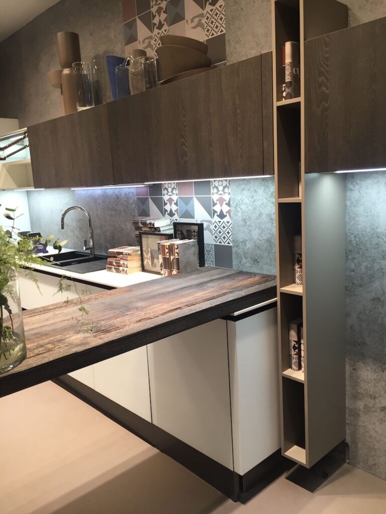
Mixed Geometric Tile Breaking a Wood-Dominant Kitchen

The backsplash introduces multiple shapes and motifs, cutting through the heavy wood surfaces that surround it. It acts as a visual reset between darker cabinetry and open shelving.
This type of tile changes the balance. Without it, the space would feel dense. With it, the wall gains contrast, detail, and a clear focal point behind the work zone.
Patchwork Tile Wall Framing a Linear Kitchen Layout

Different tile patterns are placed side by side, creating a patchwork effect that breaks any sense of repetition. Each section shifts slightly in tone and geometry, so the wall never reads as one flat surface.
This works because the rest of the kitchen stays controlled. Straight lines, muted wood, and a simple layout allow the backsplash to carry variation without overwhelming the space.
Soft Pattern Tile With Wood Hood Frame

The tile pattern sits tight and controlled, almost fading into the background until you get closer. What changes the read is the wood hood frame. It cuts through the grid and gives the backsplash a clear edge instead of letting it run endlessly.
This setup feels measured. The pattern adds texture, but the wood defines where it starts and stops, which keeps the wall from feeling busy.
Low-Height Backsplash With Subtle Repeat Pattern

The backsplash stays low, almost understated, but the repeating motif runs the entire length of the counter. It quietly connects sink, prep space, and stove without asking for attention.
What stands out is restraint. The pattern does the work while everything else stays clean, which keeps the kitchen from feeling overdesigned.
Full Wall Blue Pattern Behind Range

Here the tile takes over the full wall and shifts the balance of the room. The blue pattern builds density behind the range, making that section feel heavier and more defined than the rest.
It changes how the space reads. Instead of blending in, the cooking area becomes the anchor.
Patterned Range Wall Anchoring the Kitchen

The tile doesn’t stop at the stove. It spreads wider and ties multiple elements together into one continuous surface. Cabinets, hood, and range start to feel connected instead of separate pieces.
This approach simplifies the layout visually. One surface replaces several competing ones.
Warm Neutral Tile With Vintage Motif

The pattern leans traditional, but the color keeps it grounded. It sits close to the tones of the cabinetry, so nothing jumps out too fast.
The result feels settled. You get detail without contrast, which makes the kitchen easier to live with long term.
Full Height Pattern Wall With Niche Detail

The tile runs from counter to hood without interruption, then the niche cuts into it and shifts the rhythm. That small break adds depth and gives the wall a second layer of use.
It’s not just surface anymore. It becomes storage, display, and backdrop at the same time.
Mosaic Backsplash With Color Gradient

This is less about repetition and more about flow. The colors move across the wall, creating a loose gradient that feels assembled rather than installed.
It reads like a one-off piece. The backsplash turns into something closer to artwork than a standard finish.
Continuous Black and White Pattern Strip

The pattern runs in a straight line across the entire kitchen, creating a strong horizontal break between cabinets and counter. The contrast keeps it sharp and easy to follow.
It organizes the space without adding bulk. Everything above and below stays simple.
Floral Pattern Tile With Soft Blue Cabinets

The floral pattern softens the wall, but the palette keeps it controlled. The blue cabinets echo the tones in the tile, so nothing feels disconnected.
This pairing feels intentional. The backsplash and cabinetry work as one layer instead of two separate choices.
Large Graphic Tile With Bold Geometry

The scale shifts here. The pattern is large enough to read from across the room, not just up close. It changes the wall into a visual block instead of a textured surface.
This kind of tile demands space around it. The simpler the rest of the kitchen, the stronger it reads.
Illustrated Tile With Story Detail

Each tile carries its own small scene, so the backsplash builds detail piece by piece. It slows the eye down because there is something new in every section.
It feels personal. Less like a surface choice, more like something collected over time.
Mixed Pattern Geometry With Contrast Colors

Different shapes and tones collide in one layout, but the structure keeps it from turning chaotic. Light and dark pieces create rhythm across the wall.
This type of backsplash adds energy. It pushes the kitchen away from safe and into something more defined.